PHP, JavaScript, HTML, web hosting and CSS.
What do these things have in common?
Answer: I had no idea what they all meant 6 years ago. (there are probably more correct answers) But that didn’t stop me from registering www.trackinghappiness.com on April 1st, 2017.
Tracking Happiness started as a very simple blog. I wanted to share with others how powerful tracking my happiness was, and how it has positively influenced my mental health, self-awareness, and my life in general.
This short post will showcase some of the site’s design changes, to show you what a complete design newbie (like me) can do with a bit of time on his hands.
2017 design
At first, I had no idea how to design a website (let alone make it pretty, but I didn’t learn that any time soon). So I just used a standard website template and went from there.
This is what it looked like:
(if you remember this design, that means you’ve been around for over 3 years already!)
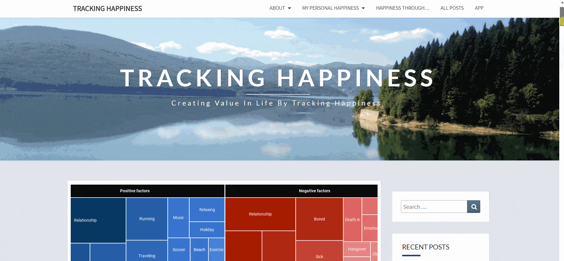
At one point, some people pointed out to me that my homepage wasn’t clear. Was this just a blog? What was this all about? These people kindly told me that it should be clear what Tracking Happiness really is.
2018 design
So I spent some long nights re-designing the frontpage into this:
(I discovered the “Title with image background” feature, and opened the floodgates on that one…)
After a couple of months, people started to let me know how much they disliked the specific color blue I used. Also, where the hell is my logo? A site like Tracking Happiness should have a logo!
I eventually opened my wallet and hired someone who could make me a proper logo. Mind you, Tracking Happiness was earning exactly $0.00 at the time, so this was not a light decision!
But I eventually got a logo that is still proudly presented on the site to this day!
Edit: not anymore!
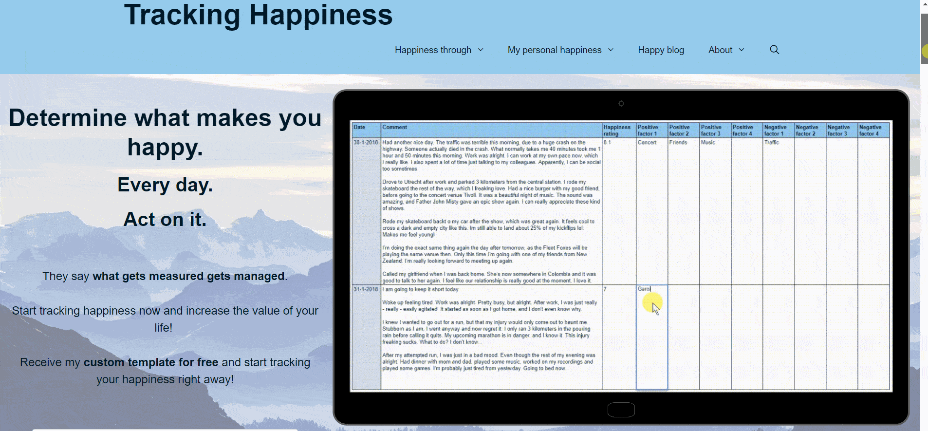
2019 design
Last year, I went on another “design spree” and was quite happy with the result:
I replaced the blue colors with a warm and friendly mix of blue and green. I thought the color palette matched perfectly with the new shiny logo!
At the time, Tracking Happiness was still struggling to reach an audience. But I was already extremely happy with the audience that I had. Mind you, when I first registered the website in 2017, I was just looking to interact with like-minded people.
I woke up to wonderful e-mails from you guys every couple of weeks, which made it all worth it.
After a while, however, I grew kinda sick of that weird half-blue-half-green color scheme.
Also, the website used lots of clunky page builders that are often used by newbies (like me) that are a pain in the @#% to maintain.
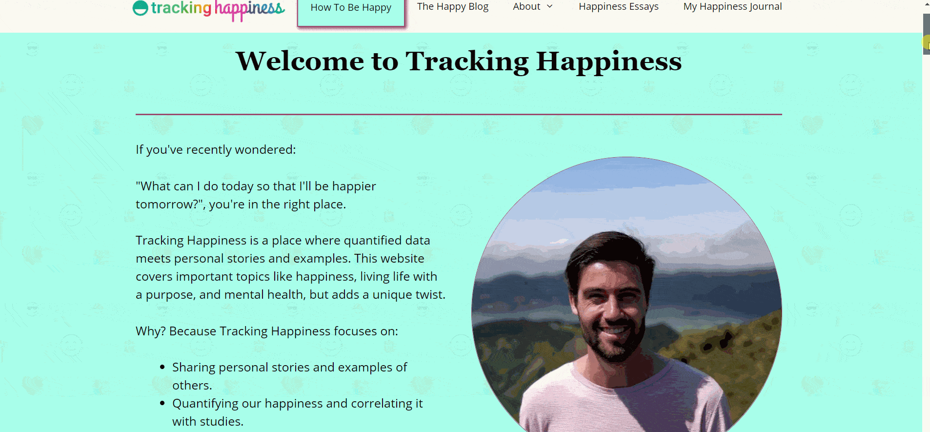
So after a couple of sleepless nights and re-iterations, I finally settled on the current design.
For now…
This current design is less colorful and flashy, but I really like the simplicity and minimalistic approach.
In a couple of years, I went from a complete design noob to… well. Uhm. I guess I’m still a total noob. But at least, now I know a little bit more about PHP, JavaScript, HTML, web hosting, and CSS.
Maybe, someday, Tracking Happiness will be praised for its ground-breaking design, but I’m not holding my breath for that one.
Wrapping up
If you want more behind-the-scenes updates like this one, then join the Tracking Happiness community and sign up for periodic email updates here:
Which design did you like the most?
Did you like the colorful designs more than the current one? Or do you think it’s all a hideous mess that should be killed with fire?
Let me know in the comments below!